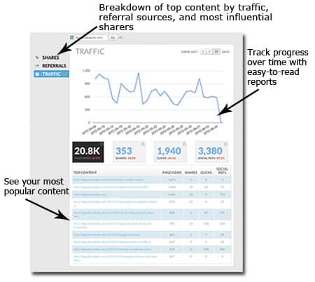
As both a data geek and blogger, re-imagining Shareaholic’s publisher analytics was the perfect project to be tasked with. Oh, analytics dashboard: I remember when you were a whiteboard scribble, then a wireframe… merely a twinkle in our eyes. Now that it’s here, it’s so thrilling to have a product to show people and get user feedback on!
We’ve got a long way to go. We have more than 200,000 publishers, and growing. Redesigning something that is going to add value for that many people isn’t easy, and we are determined to do this right by involving YOU in our process early on. We want to make this the best it can be!
So today we are excited to announce the first version of our new publisher analytics. You can test drive it here: http://bit.ly/SHRanalytics.
Your Shareaholic publisher analytics dashboard includes:
- Breakdown of your most popular content, including how many pageviews, shares and clicks on shares those top-performing posts generated.
- Easy-to-read charts showing traffic, shares and click trends over time.
- Analysis of top-performing social networks for referrals and shares for your audience.
- An inbound links report, showing which new inbound links are sending the most traffic to your content.
- A list of your top sharers so you can see who you want to connect with in your community.
We’d really love to hear what you think, seriously! If you’d love to give us some feedback on this (and get a plushycomfyawesome Shareaholic t-shirt for your much appreciate time…) sign up below to get on our publisher feedback list. We’d love to chat with you.
Stay up to date here on the blog for more developments on this product and also for more announcements on future products. It’s going to be exciting to watch this evolve.
